It looks like you are using an ad blocker. That's okay. Who doesn't? But without advertising revenue, we can't keep making this site awesome. Click the link below for instructions on disabling adblock.
Welcome to the Newschoolers forums! You may read the forums as a guest, however you must be a registered member to post.
Register to become a member today!
-WZ-1. Please move upvote back to right, its the only thing that i still notice now, ive more or less gotten used to the gradient but the upvote on the left just messes up the flow
i think you have your lefts and rights confused brah
Mr.BishopLook at the old forums and look at the new ones. Really look at it, and really ask yourself what you don't like so we can get this solved and move on to cooler stuff!
Make the post count and member title (No Life, Noob ect.) black again. I also think it would be better with the upvote/downvote on the left but honestly, doesn't make that much of a difference to me.
Yes, its the spacing. Don't panic, tomorrow or the next day we'll add the selector. Big fonts for those with massive monitors and shitty eyes, and then super crammed old school shit for everyone else.
The referenced post has been removed.
Good! That is the biggest improvement this thing brought.
DIX~And I'm still hating the new full
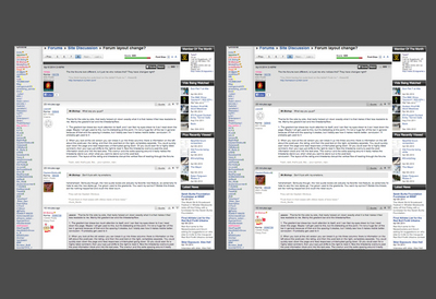
Are you hating it less? We've been making changes... look at the side by side photos dude we're getting really fucking close to the old layout. Please try to realize that at least a portion of your pitch-fork wielding hate is overblown. Its not that different and we're changing.
brotoi have to say that full res clicky photos are awesome - it even works on mobile too! no more "WTF IS IN THIS PHOTO WITH THE ABSURDLY AWKWARD ASPECT RATIO??"
Fuck yeah boss. Again, these updates are designed so we can actually make this bullshit better. Its easy to think that 10 year old forums are still awesome in 2014... but jesus christ there's a lot of awesome shit the internet can do now that old shit can't. We need to modernize these fuckers without losing what everyone loves.
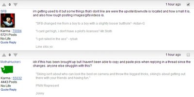
im getting used to it but some things that i dont like are were the upvote/downvote is located and how small it is, and also how rough posting images/gifs/videos is.
idk if this has been brought up but I haven't been able to copy and paste pics when replying in a thread since the changes. anyone else strugglin with this?
SFBim getting used to it but some things that i dont like are were the upvote/downvote is located and how small it is, and also how rough posting images/gifs/videos is.
images and videos are a super smooth process now?? no more finding embed code
ps here's what I think the layout should look like.
solid line added under gradient, time and karma arrows swappwed, karma text greyed out, icon and list swapped.
Definitely still hating it. I probably won't use Ns on my computer very much any more, I'll switch over to my phone. They features are great and all, but god the look and feel are just not good.
nkmo.1. Change the gradient to a solid light gray box.
2. Reorder the user info so username and icon are together, with everything else under.
3. Bring back post preview.
4. ???
5. Profit
ayylmaoimages and videos are a super smooth process now?? no more finding embed code
ps here's what I think the layout should look like.
solid line added under gradient, time and karma arrows swappwed, karma text greyed out, icon and list swapped.
Both of these look good. I'm especially a fan of the grey text by the username and the icon swap
The quoted text whether the blue dotted line or the bars to the left, both look good.
ayylmaoimages and videos are a super smooth process now?? no more finding embed code
ps here's what I think the layout should look like.
solid line added under gradient, time and karma arrows swappwed, karma text greyed out, icon and list swapped.
I like this too, we'll try this.
The referenced post has been removed.
It was more drastic before, we've been making a ton of changes already.
ABallsThis is great
I_liketobutterBoth of these look good. I'm especially a fan of the grey text by the username and the icon swap
The quoted text whether the blue dotted line or the bars to the left, both look good.
theBearJewI really like this.
^^To the three above here - so you're saying that with some tweaks you could get behind the post bar?
If so (and if others agree) it would be rad to make this thing work. I've found I got used to it over a bit of time, and it will give us a ton of room to add future features to both profiles and forums.
maybe I'm the epitome of lazy, but I don't feel like quoting people anymore. just too much hassle clicking on the box then scrolling to the bottom to click reply.
can there at least be a 'quick quote' button or something?
It was more drastic before, we've been making a ton of changes already.
^^To the three above here - so you're saying that with some tweaks you could get behind the post bar?
If so (and if others agree) it would be rad to make this thing work. I've found I got used to it over a bit of time, and it will give us a ton of room to add future features to both profiles and forums.
Yes absolutely. Though you say you get used to the upvote on the right side, I think it makes more sense on the left. I sometimes scroll down looking at the left side to find a specific user who posted, if I catch that a post has a lot of up votes or down votes, I may stop and read it.
nkmo.1. Change the gradient to a solid light gray box.
2. Reorder the user info so username and icon are together, with everything else under.
3. Bring back post preview.
4. ???
5. Profit
ayylmaoimages and videos are a super smooth process now?? no more finding embed code
ps here's what I think the layout should look like.
solid line added under gradient, time and karma arrows swappwed, karma text greyed out, icon and list swapped.
YES please these two combined. Also, just a heads up, changing to the smaller font makes this current layout look slightly better.
When a thread gets deleted it should disappear from My Threads. Right now it links you to the deleted forum I think and tries to get you to login again. Kinda annoying
VinnieFmaybe I'm the epitome of lazy, but I don't feel like quoting people anymore. just too much hassle clicking on the box then scrolling to the bottom to click reply.
can there at least be a 'quick quote' button or something?
this. i just put in way too much effort in order to quote this
cp1994Yeah, that's new. I agree, but the past that is most annoying to me about that is that you can't see which video is which.
well... if people would just upload their videos to the NS player then you'd be able to see what video is what. It's been like this for news articles for a while now when embedding videos that aren't native to NS... until people do that, I think the black screen followed by an ad will have to stay
nutz.well... if people would just upload their videos to the NS player then you'd be able to see what video is what. It's been like this for news articles for a while now when embedding videos that aren't native to NS... until people do that, I think the black screen followed by an ad will have to stay
except it's also like that for the plethora of movies that aren't skiing related in NSG. can't even see what they are before playing them.
also is NS even getting ad revenue from ads before youtube videos? since with adblock enabled on youtube the ads before youtube videos don't play even when they're embedded on NS.
hahaha mr.bishop with the pwn on the whiteness! tbh i didn't realize the changes were so subtle (and now that im used to it better in my opinion) until you showed them side by side
publicenemy-420hahaha mr.bishop with the pwn on the whiteness! tbh i didn't realize the changes were so subtle (and now that im used to it better in my opinion) until you showed them side by side
there was no pwning re: whiteness, there's no denying there is more negative space on this new format, which must be what gives the overwhelming brightness. that and a couple other things, general layout, and thread listings
it's growing on me, mostly because of the features, but i still miss the old format and always will. bishop was probably right yesterday when he said my inclination to come on here less, which i still have, also has other factors. ive been slowly getting weary of certain aspects of the site but that's to be expected in your 20s on NS
VinnieFmaybe I'm the epitome of lazy, but I don't feel like quoting people anymore. just too much hassle clicking on the box then scrolling to the bottom to click reply.
can there at least be a 'quick quote' button or something?
Yes, we're going to make the text of the quote button blue and clickable.
theBearJewYes absolutely. Though you say you get used to the upvote on the right side, I think it makes more sense on the left. I sometimes scroll down looking at the left side to find a specific user who posted, if I catch that a post has a lot of up votes or down votes, I may stop and read it.
Ask and ye shall receive.
DIX~When a thread gets deleted it should disappear from My Threads.
Didn't realize this was happening, reported.
The referenced post has been removed.
They have not. This is definitely a dirty hack to make more money for Newschoolers. Its too much right now, so we'll back off, make sure it isn't black but we'd still like to do the occasional ad in the forums.
It really does help us out.
Randy_QuenchThe forums are too white/bright now. Its annoying frankly.
They're just as white as they used to be. Bright however, perhaps. Stare closely at the comparison image I posted back on page 7 of this and please come to the table with more specific helpful suggestions. "Its too bright' has been said to death and it isn't helping anyone.
nutz.well... if people would just upload their videos to the NS player then you'd be able to see what video is what. It's been like this for news articles for a while now when embedding videos that aren't native to NS... until people do that, I think the black screen followed by an ad will have to stay
It won't have to stay forever TBH - its just a dirty hack right now. Its really, really, really great for ad revenue, but its too far right now and I get that. We'll work on that as soon as we get these forum issues sorted out.
i think upvotes on the left are are weird because its sooooo far from quote thing and i like being able to browse down the thread and easily spot which post has the most upvotes and now its harder, you can still do it now but i find it gets losts is the mix or something. i tend to click related content and stuff as well so maybe thats why i like having the stuff on the right as i rarely ever clcik the member stuff or karma or any of that jazz
publicenemy-420hahaha mr.bishop with the pwn on the whiteness! tbh i didn't realize the changes were so subtle (and now that im used to it better in my opinion) until you showed them side by side
The pwning is more about the fact that people latch onto only one aspect when they're really reacting to another. That is the hardest part about web dev on a site with a big userbase.
RubberSoulthere was no pwning re: whiteness, there's no denying there is more negative space on this new format, which must be what gives the overwhelming brightness. that and a couple other things, general layout, and thread listings
it's growing on me, mostly because of the features, but i still miss the old format and always will. bishop was probably right yesterday when he said my inclination to come on here less, which i still have, also has other factors. ive been slowly getting weary of certain aspects of the site but that's to be expected in your 20s on NS
no big deal though. keep up the good work NS
We analyzed the shit out of it this morning, and I don't think its negative space its 'brightness'. What is causing it was first the bigger text, second the fact that there was blue in the quote reply, black text for post count and the post bar. We can absolutely just go right back to exactly the same format as before if we want to, but people are starting to say they like the post bar now. We really need to come to something on this, because we're here launching changes and we have way more stuff we can do than fuck around with layout.
However, its important at Newschoolers that we give you guys what you want. That is REALLY important to us, and something that if you do decide to leave you're not going to find other places nearly as much.
I'd be curious to start the discussion more about what you have been growing weary of and why. Care to make a thread on it? Its a valid discussion, and at this point in the year its the perfect time to make changes. Of course it might be more of a life/cultural issue which is different, but its a worthy discussion to have.
Anyway, any NSer is always welcome back. We're here for the long haul, and we know we'll go through ups and downs as the years progress - but our commitment is to this community and the wonderful sport of skiing.
.Andrew.I mentioned this earlier and it got buried.
this contrast I think is needed to break up the posts more, and the light grey right now is really terrible IMO. I think it should be darker like this.
.Andrew.^Oh or maybe even get rid of the gradient, that's my biggest peeve with the style honestly.
Please take this advice. Everything runs together and is hard to read with the new format.
publicenemy-420i think upvotes on the left are are weird because its sooooo far from quote thing and i like being able to browse down the thread and easily spot which post has the most upvotes and now its harder, you can still do it now but i find it gets losts is the mix or something. i tend to click related content and stuff as well so maybe thats why i like having the stuff on the right as i rarely ever clcik the member stuff or karma or any of that jazz
gradient bar looks better though
louie.miragsRead the thread brah... Lots of complaints made it the way it is now
ObeseBunnyPlease take this advice. Everything runs together and is hard to read with the new format.
Holy shit... we're getting into design by committee here now. Darker, lighter, no bar, bar.
We're not going to get anywhere if you guys don't agree on anything.
I don't think a gigantic black bar between every single post is going to help out anyone. If that is the only solution then fuck it we'll go right back to the old layout and damn the mobile consequences.
Huh. That's weird, sometimes i'm getting it as the bar, but other times I'm getting it as just the gradient. Regardless I think either way, people are already getting used to it. I know I am, although with the bar there's something about it that I don't like, I just can't put my finger on it right now...
Anyone want to stick a line in the sand and say fuck this god damn bar and the horse it rode in on? Lets not talk about the bar anymore, as I think we are starting to agree its the right color. Super dark will suck for sure so I'm giving that a no.
Bar / no bar?
Concurrently, we can say fuck yes I'm into this update now, I love it on mobile and please guys could you get back to giving us more awesome features?
Note things still to launch:
-thread preview button
-darker lines in between threads in thread listing
-text of quote button a link to 'quick quote' that post
-Editing of BST threads
-Fix to cult forums on mobile
-Posts taking 5 minutes to show up
Mr.BishopThe pwning is more about the fact that people latch onto only one aspect when they're really reacting to another. That is the hardest part about web dev on a site with a big userbase.
We analyzed the shit out of it this morning, and I don't think its negative space its 'brightness'. What is causing it was first the bigger text, second the fact that there was blue in the quote reply, black text for post count and the post bar. We can absolutely just go right back to exactly the same format as before if we want to, but people are starting to say they like the post bar now. We really need to come to something on this, because we're here launching changes and we have way more stuff we can do than fuck around with layout.
However, its important at Newschoolers that we give you guys what you want. That is REALLY important to us, and something that if you do decide to leave you're not going to find other places nearly as much.
I'd be curious to start the discussion more about what you have been growing weary of and why. Care to make a thread on it? Its a valid discussion, and at this point in the year its the perfect time to make changes. Of course it might be more of a life/cultural issue which is different, but its a worthy discussion to have.
Anyway, any NSer is always welcome back. We're here for the long haul, and we know we'll go through ups and downs as the years progress - but our commitment is to this community and the wonderful sport of skiing.
I still feel like there's more negative space but i should take your word for it, you pay more attention and analyze it in a more educated way. i feel like my knee jerk reaction is important to consider cause that's how it works for us consumers, but you've really impressed me (as always) in really listening to what i and others have said so big ups dude. i need to send a case of beer to you guys in the NS office some time
re: what ive grown weary of-- well as you said, it's more of a "cultural" thing. i love the mixed maturity levels here and the comedy that comes out of it, but sometimes i grow weary of some of the immature shit. i'll see an informative, if opinionated, post with 0 or negative upvotes (but NO REBUTTAL), then 5 posts down ill see some hackneyed bullshit joke or insult recycled for the millionth time upvoted to oblivion, even more so if it's posted by some pandering orange name. don't get me started on threads where someone disagrees with an orange name-- woof. (i do love that orange names get into the mix though, and the vast majority post great shit)
but that's not the site's fault. as i always try to stress when i bitch about stuff, you guys have always been great about improving the site over the years
my opinion on the bar? i dislike it. and i think it might have something to do with my opinion that the new format is distracting. if it were up to me, it'd be gone