It looks like you are using an ad blocker. That's okay. Who doesn't? But without advertising revenue, we can't keep making this site awesome. Click the link below for instructions on disabling adblock.
Welcome to the Newschoolers forums! You may read the forums as a guest, however you must be a registered member to post.
Register to become a member today!
Mobile is a million times better, and I reckon once culture shock is recovered from it will all get better.
BUT I'm either tripping balls or just being super OCD but I think the names and icon info is in a smaller font than the writing in posts? That for some reason really throws me. Also the top of peoples names doesn't line up with the top of posts. I have no idea if it was the same way before but it's doing my head in.
Also the Forums>>Site Discussion>>Forum layout change? bar at the top of threads looks unsightly huge!
Other than cosmetic shit though, this update seems pretty legit! Cheers lads!
SitBUT I'm either tripping balls or just being super OCD but I think the names and icon info is in a smaller font than the writing in posts? That for some reason really throws me. Also the top of peoples names doesn't line up with the top of posts. I have no idea if it was the same way before but it's doing my head in.
Ok scratch that I'm just fucking retarded and didn't see the font size change thing.
Mr.BishopThe major part of this upgrade was for our mobile users... so about 30% of people should be fucking amped. Mobile will see the most current and future benefit of anything.
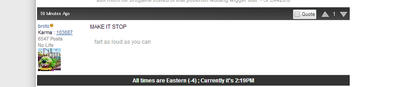
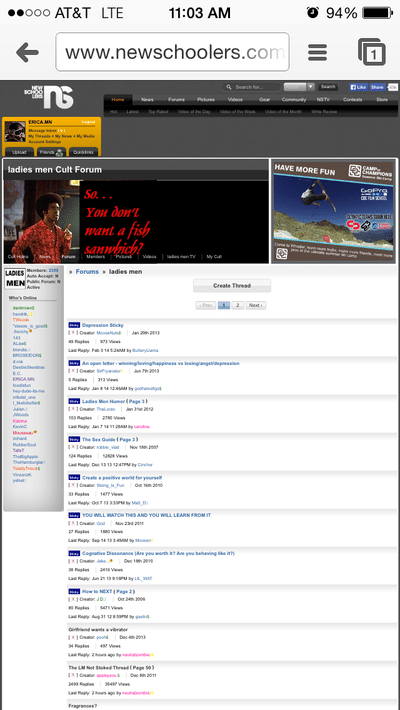
I cannot emphasize how irritating the formatting is in LM right now. I hate to bitch, but I spend about half my time there and really don't like having to flip the phone if I want to be able to read a thread.
why the fuck are people so bad at criticism. i didn't have to read much to come to that conclusion..
I like the updates.
there's a couple things i don't like at the mo - off the top of my head
-the font in this reply box is too wide and typewriter-ish (when the GUI is not activated). if you could, please change the spacing
-post preview was very useful and definitely needs to be brought back. i'm aware this has been said already
-karma arrows could do with being aligned next to the timestamp. p.s timestamp update is so mad
- maybe increase the distance between the users name and their karma to distinguish the two and make it easier for identifying people around the forums (if you want me to elaborate I will)
*CUMMINGS*I cannot emphasize how irritating the formatting is in LM right now. I hate to bitch, but I spend about half my time there and really don't like having to flip the phone if I want to be able to read a thread.
Can you post up a screen grab of what you mean?
*DUMBCAN*Clearly not :(
No more html editing in the embed window = no more fake links, I HATE YOU NOW hahaha
We did change a lot with the HTML for security. We've known we had to do this for a very long time, and there's some bad parts of it but we gain a ton in terms of ensuring nothing bad happens.
ayylmaowhy the fuck are people so bad at criticism. i didn't have to read much to come to that conclusion..
I like the updates.
there's a couple things i don't like at the mo - off the top of my head
-the font in this reply box is too wide and typewriter-ish (when the GUI is not activated). if you could, please change the spacing
-post preview was very useful and definitely needs to be brought back. i'm aware this has been said already
-karma arrows could do with being aligned next to the timestamp. p.s timestamp update is so mad
- maybe increase the distance between the users name and their karma to distinguish the two and make it easier for identifying people around the forums (if you want me to elaborate I will)
as far as that, the updates are sick.
Did you used to use the GUI editor? It looks pretty similar for me having never used the GUI previously. Also note, major updates to the GUI so its a lot better to use now.
What do you mean by Karma arrows? You mean the upvote/downvote?
I posted this around page 2-3, but still having issues with thread refreshing after posting. I have to refresh 3 times for my post i just made to show up.
With embedded videos, at least remotely hosted, I have to hit the play button twice.
Overall, GUI editor works well. I could never get the old one to work for some reason.
Could you guys darken the separating line between thread listings. Depending on my monitor, I can't really see it.
I_liketobutterI posted this around page 2-3, but still having issues with thread refreshing after posting. I have to refresh 3 times for my post i just made to show up.
With embedded videos, at least remotely hosted, I have to hit the play button twice.
Overall, GUI editor works well. I could never get the old one to work for some reason.
Could you guys darken the separating line between thread listings. Depending on my monitor, I can't really see it.
The old GUI was fuuuucked. There was no saving it, so it simply had to go.
Thread refresh is known bug and we're working on it.
Can you tell me if you actually have to hit it twice, or if you wait for a few seconds (when there isn't an ad) if it in fact actually plays on its own? It seems that second video you put up fits this case for whatever reason.
it might be too 'generic forum'-y for some people.
I mean really if we're not being dramatic here going 'generic forum'-y would mean adding massive gamer cards at the bottom of each post and like huge massive bling, flair and badges to like a 400px tall list of icons, links, etc.
We're pretty darn stripped and basic here, way more so than a ton of other forums even if we mess around with a little bit of shit.
Mr.BishopDo you love it more than you love the idea of it going back to where it used to be?
It does make it easier when scrolling through post.. I'm digging the changes on mobile! The only thing is on windows XP at my college it just kept saying "error on page" when I tried posting. But, that's definitely the ancient school computers problem. I don't post much from there anyway
louie.miragsIt does make it easier when scrolling through post.. I'm digging the changes on mobile! The only thing is on windows XP at my college it just kept saying "error on page" when I tried posting. But, that's definitely the ancient school computers problem. I don't post much from there anyway
So did you guys straight up get rid of the image upload ability? Or am I missing something? When I enable GUI and hit the NS icon to add media, I have no option to browse and upload.
Can you tell me if you actually have to hit it twice, or if you wait for a few seconds (when there isn't an ad) if it in fact actually plays on its own? It seems that second video you put up fits this case for whatever reason.[/quote]
Ok, yeah it does take about 3-5 seconds to start after hitting play once. But both do start playing after hitting play once.
What fooled me is that after hitting play, you get the buffer thing, then goes back to showing the play button again. So I thought, oh, I gotta hit it again. Idk how easy it is to fix that but showing just the buffer for that 3-5 seconds wouldn't be bad at all
Mr.BishopI mean really if we're not being dramatic here going 'generic forum'-y would mean adding massive gamer cards at the bottom of each post and like huge massive bling, flair and badges to like a 400px tall list of icons, links, etc.
We're pretty darn stripped and basic here, way more so than a ton of other forums even if we mess around with a little bit of shit.
see but when you talk about "being dramatic" and other people say "it's not a big deal" you're missing the point. there's a reason i dont go on TGR much at all, even though it's 100% more relevant to my skiing interests nowadays, and that's because of the very fundamental difference in how pleasing it is to the eye. written down that sounds trivial but it's not at all, industries are built on the fact that subtle differences to your eye make all the difference
i completely understand if this overhaul was "necessary" and i can already see some of the new features are great but if this has to happen, can we at least
1) not try to pretend it isn't a big change and people who complain are "dramatic"
2) do your best to get back the nice elegant greys etc of NS and get rid of this shocking white generic look
again, not a threat or whatever but if the look stays the same i'll be spending 5 minutes max on here from now on, and that's a real shame because ive loved the hell out of this site for 13+ years
I_liketobutterCan you tell me if you actually have to hit it twice, or if you wait for a few seconds (when there isn't an ad) if it in fact actually plays on its own? It seems that second video you put up fits this case for whatever reason.
Ok, yeah it does take about 3-5 seconds to start after hitting play once. But both do start playing after hitting play once.
What fooled me is that after hitting play, you get the buffer thing, then goes back to showing the play button again. So I thought, oh, I gotta hit it again. Idk how easy it is to fix that but showing just the buffer for that 3-5 seconds wouldn't be bad at all[/QUOTE]
RubberSoulsee but when you talk about "being dramatic" and other people say "it's not a big deal" you're missing the point. there's a reason i dont go on TGR much at all, even though it's 100% more relevant to my skiing interests nowadays, and that's because of the very fundamental difference in how pleasing it is to the eye. written down that sounds trivial but it's not at all, industries are built on the fact that subtle differences to your eye make all the difference
i completely understand if this overhaul was "necessary" and i can already see some of the new features are great but if this has to happen, can we at least
1) not try to pretend it isn't a big change and people who complain are "dramatic"
2) do your best to get back the nice elegant greys etc of NS and get rid of this shocking white generic look
again, not a threat or whatever but if the look stays the same i'll be spending 5 minutes max on here from now on, and that's a real shame because ive loved the hell out of this site for 13+ years
Trust me I've been at this long enough to know that there truly is a difference between making mistakes that will harm the site and being dramatic. Trust me. I really, really, really, really do know this stuff.
Our mistake isn't that it was the wrong idea, its that we shocked everyone too much. There's an immense amount of psychology that goes into launching updates to things people use. Have you followed the facebook changes? Gmail changes? Ebay changes?
Each time depending on how they're launched they get massive reactions, but in the end people adapt to new layouts and increase usage. The way you launch it depends on how hard the adaptation phase is, which is what we made as a mistake.
That all being said - we are listening and we're going to make some tweaks. Shocking white generic look would disappear in your brain in a few weeks, and you'd be back if the experience gives you what you want.
Also everyone really needs to stop saying 'generic' when referring to forums. Forums are every color known to man, there is no such thing as a 'generic' forum.
I'd also bet anything that the biggest thing that was shocking was the faunt size change. I bet that when we put that back by default its going to feel a ton better.
- Someone had an idea to make the headers on each post grey, I liked it, mad the posts stand out from each other.
But more importantly.... CLICKY FORUM PHOTOS.
Over in M&A we'd quite like to be able to see photos in full res without having to include separate links.
Photos clicky for full res added. As well bumped up thumbnail quality to 100% which might help with the default display being washed. It was 80% before.
Get the discussion going in M&A of what would be the perfect photo setup, and we can look at adding that too.
Mr.BishopPhotos clicky for full res added. As well bumped up thumbnail quality to 100% which might help with the default display being washed. It was 80% before.
Get the discussion going in M&A of what would be the perfect photo setup, and we can look at adding that too.
Mr.BishopAny really awesome CSS ninjas out there got some ideas?
Ok so here's a thought for you to adjust this contrast issue.
Right now you basically have three elements of each post.
1)The overall post box that holds a light grey/white gradient at the top
2) The optional quote box that is in your grey gradient with a dark grey bar at the front of it
3) The obligatory actual post.
Only one of these things need to change to get some contrast. It definitely shouldn't be number 3 obviously. You want the clean white and I like it. I also think you should keep number 2 as it is. The quote is obvious enough since you've got the quoted member in bold and italics.
I think you should adjust the gradient at the top. You seem to have a them of grey/white/blue going on, but you're not utilizing blue anywhere on the forums. Your current shade of blue you put your headings in is RGB #2A61A2 Use that color and make it a gradient from the dark blue at the top, fading down four or five shades to the actual post. Maybe go from that down to #94b0d0
Take a peek at it here: http://www.color-hex.com/color/2a61a2 and look at the "Tints of 2A61A2" You'd effectively take those first 5 tints and gradient them down as you have it now.
The color will effectively separate the posts and will spice it up a bit so maybe some haters will stop claiming generic and bitching about white.
Trust me I've been at this long enough to know that there truly is a difference between making mistakes that will harm the site and being dramatic. Trust me. I really, really, really, really do know this stuff.
Our mistake isn't that it was the wrong idea, its that we shocked everyone too much. There's an immense amount of psychology that goes into launching updates to things people use. Have you followed the facebook changes? Gmail changes? Ebay changes?
Each time depending on how they're launched they get massive reactions, but in the end people adapt to new layouts and increase usage. The way you launch it depends on how hard the adaptation phase is, which is what we made as a mistake.
That all being said - we are listening and we're going to make some tweaks. Shocking white generic look would disappear in your brain in a few weeks, and you'd be back if the experience gives you what you want.
Also everyone really needs to stop saying 'generic' when referring to forums. Forums are every color known to man, there is no such thing as a 'generic' forum.
I'd also bet anything that the biggest thing that was shocking was the faunt size change. I bet that when we put that back by default its going to feel a ton better.
yes, i have followed the examples you used. and people have plenty of legitimate gripes about the formats gmail and facebook have taken (gmail obviously being much more important), so i sort of resent that the rest of your reply to me concerns itself with "this is more about the transition than the format, you'll get used to it"
and "generic white forums" is just the way people are referring to what we are comparing this new format to. it's not that "generic" is intrinsically bad, it's that these generic forums with garish white everywhere are largely disliked and people (including the mods, admins, coders etc of NS!) have said for YEARS that one of the best things about NS is that we had this gorgeous, simple, elegant format and look to it that is easy on the eyes.
so it seems a little disingenuous to say "no dude you'll get used to it, it's only about the transition." i trust you that you really really really know this stuff, and i say all the time how much i appreciate all the care and work you do on this site, but please don't discount what im saying with a faulty appeal-to-authority argument when ive been on this site for a very long time and know exactly what im talking about both as a consumer and as someone who does plenty of visual work in a lab for my job
**This post was edited on Apr 9th 2014 at 5:24:32pm
CaptainDickbuttTake a peek at it here: http://www.color-hex.com/color/2a61a2 and look at the "Tints of 2A61A2" You'd effectively take those first 5 tints and gradient them down as you have it now.
If you have a sandbox and can easily adjust your code to see what I'm talking about, go to your CSS and make this tiny change:
On Change the gradient setting from '#E7E7E7' TO '2A61A2'. Leave the end gradient as #ffffff and it should start with your signature blue and go to white.
SDrvpertesting to see if you can still change quotes.
Can we still change quotes? Tried to above. If so that is something that should probably get fixed. While its fun for a bit, it will get annoying later on.
Also I think the new layout will be good in the end. Shock factor wears off and we will probably like it more. I like the idea of quoting multiple things.
But wheres the preview button and the "Return to thread" link at the bottom?
RubberSoulyes, i have followed the examples you used. and people have plenty of legitimate gripes about the formats gmail and facebook have taken (gmail obviously being much more important), so i sort of resent that the rest of your reply to me concerns itself with "this is more about the transition than the format, you'll get used to it"
and "generic white forums" is just the way people are referring to what we are comparing this new format to. it's not that "generic" is intrinsically bad, it's that these generic forums with garish white everywhere are largely disliked and people (including the mods, admins, coders etc of NS!) have said for YEARS that one of the best things about NS is that we had this gorgeous, simple, elegant format and look to it that is easy on the eyes.
so it seems a little disingenuous to say "no dude you'll get used to it, it's only about the transition." i trust you that you really really really know this stuff, and i say all the time how much i appreciate all the care and work you do on this site, but please don't discount what im saying with a faulty appeal-to-authority argument when ive been on this site for a very long time and know exactly what im talking about both as a consumer and as someone who does plenty of visual work in a lab for my job
Yeah but the problem with the first and third part of your statement is they contradict each other. In each of the above cases people did in fact get used to it in the end, and even dramatically increased their usage. The difference between them was how they handled the drama.
For example eBay -
"eBay.com: Satisfying their Users with Gradual Evolution
At eBay, they learned the hard way that their users don't like dramatic change. One day, the folks at eBay decided they no longer liked the bright yellow background on many of their pages, so they just changed it to a white background. Instantly, they started receiving emails from customers, bemoaning the change. So many people complained, that they felt forced to change it back.
Not content with the initial defeat, the team tried a different strategy. Over the period of several months, they modified the background color one shade of yellow at a time, until, finally, all the yellow was gone, leaving only white. Predictably, hardly a single user noticed this time.
More recently, eBay recently underwent a redesign of the forms that people use to post items for sale. These pages are critical to the success of the site, used more than 1,000,000 times every week. Knowing that their users are sensitive to sudden, dramatic changes, the team came up with a novel approach to phasing in the forms.
After verifying the changes through usability testing, the team made working versions of the new pages available for previewing with a link on the existing seller's page. After looking at the preview, users had the option of making the new forms their default. By tracking how many users converted to using the new forms, the team could measure it's acceptance."
I'm not discounting you, as a matter of fact we're listening to you. I do however know that the semantics of this issue in fact weigh in favor of the changes being right, just not presented correctly.
CaptainDickbuttI think you should adjust the gradient at the top. You seem to have a them of grey/white/blue going on, but you're not utilizing blue anywhere on the forums. Your current shade of blue you put your headings in is RGB #2A61A2 Use that color and make it a gradient from the dark blue at the top, fading down four or five shades to the actual post. Maybe go from that down to #94b0d0
I mentioned this earlier and it got buried.
this contrast I think is needed to break up the posts more, and the light grey right now is really terrible IMO. I think it should be darker like this.
.Andrew.^Oh or maybe even get rid of the gradient, that's my biggest peeve with the style honestly.
Yeah I think this could take care of the issue, but your dark grey is a bit drastic. It won't take much to do what we're both saying, and I think throwing a little color in could really help.
I'm not discounting you, as a matter of fact we're listening to you. I do however know that the semantics of this issue in fact weigh in favor of the changes being right, just not presented correctly.[/QUOTE]
see i think that's the problem i have with what youre saying-- i think youre implying that the tangible, functional improvements of this update (which are great from what i can see) NECESSITATE the change in the FORM of them, when really it is just the specific route you guys chose to take
this can be analyzed and argued in the examples of ebay, gmail, etc also, but that only comes down to intangibles and pointless arguments because it boils down to semantics and subjectivity
regardless, the decision is made obviously so i guess ill just wait and see if it grows on me. if not, ive been wanting to get into TGR anyway, or hell, maybe i could even try working without checking ski forums once an hour..now there's a crazy thought
currently, the top of the page around the OP area, and the bottom of the page where you can hit reply seem disorganized and messy. I understand this you guys are working on it.
There's just too many colors, font sizes, gradients, etc. I'm not sure if the blue is throwing it off, idk. The gradient on the page numbers just seems out of place.
It's kinda like on an iphone when you have all these nice new "flattened" app logos for iOS7 and then there's the app w the old style app logo that hasn't been updated. It looks out of place
*CUMMINGS*I cannot emphasize how irritating the formatting is in LM right now. I hate to bitch, but I spend about half my time there and really don't like having to flip the phone if I want to be able to read a thread.
@Bishop, basically on mobile it reverts to the desktop settings, except zoomed in to (zoomed to full screen below). also in LM whenever I click the (page 43) part next to the thread (mobile, my threads), it goes right to page 1 instead of the last page
I hate the white with a passion. It's so lifeless and boring to look at.
I also hate the upvote/downvote now. Before it was so easy to tell right away whether a post was upvoted or down voted, now I have to look all the way to the right to see it.
Multiquote is cool, if I ever use it. I won't decide whether I like the new look or not until you change the color because right now I hate it. Its like a simplified version of Facebook