It looks like you are using an ad blocker. That's okay. Who doesn't? But without advertising revenue, we can't keep making this site awesome. Click the link below for instructions on disabling adblock.
Welcome to the Newschoolers forums! You may read the forums as a guest, however you must be a registered member to post.
Register to become a member today!
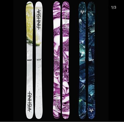
Every year it seems like Vishnu has 1 banger graphic and the other two are still good but not as hyped. This year Vishnu outdid themselves and pulled out 3 BANGER topsheets for the wets...take a look
Bubbles, cabbage and gems. 20/21 is gonna be one hell of a season
Am I the only one that doesn't love these topsheets? The ones in the OP at least are just three photographs slapped on top of the skis. Maybe people are into that, but it doesn't really feel like these images were designed for the skis as much as it feels like they just found some images and slapped them on top. Wides I definitely prefer more, as they feel more like topsheet art. Again maybe it's just me, but I feel like actual photos on skis never look that sick
I think the 2020/2021 graphics were pretty dope, they might just be photos but the cabbage lines create a really cool wave look, along with the gems zoomed in I feel like they just both look straight up pretty and have cool colors. The limes aren’t really that dope of a look but an interesting idea and pretty funny if you think about it.
I think the appeal of Vishnu’s is how they take the most basic mundane things we see in life and find a way to make them into cool top sheets. I don’t see other brands doing that really.
as far as their pre release graphics they posted today I think they kind of dropped the ball tbh. I think the people in their insta comments will say their graphics are sick regardless of what they put out. For the most part they put out dope stuff though
mitcheyAm I the only one that doesn't love these topsheets? The ones in the OP at least are just three photographs slapped on top of the skis. Maybe people are into that, but it doesn't really feel like these images were designed for the skis as much as it feels like they just found some images and slapped them on top. Wides I definitely prefer more, as they feel more like topsheet art. Again maybe it's just me, but I feel like actual photos on skis never look that sick
Skiblade420I think the 2020/2021 graphics were pretty dope, they might just be photos but the cabbage lines create a really cool wave look, along with the gems zoomed in I feel like they just both look straight up pretty and have cool colors. The limes aren’t really that dope of a look but an interesting idea and pretty funny if you think about it.
I think the appeal of Vishnu’s is how they take the most basic mundane things we see in life and find a way to make them into cool top sheets. I don’t see other brands doing that really.
as far as their pre release graphics they posted today I think they kind of dropped the ball tbh. I think the people in their insta comments will say their graphics are sick regardless of what they put out. For the most part they put out dope stuff though
rivers and van gogh are hardbody as fuck but broken glass is so bad imo
ColoradoDogfartEvery year it seems like Vishnu has 1 banger graphic and the other two are still good but not as hyped. This year Vishnu outdid themselves and pulled out 3 BANGER topsheets for the wets...take a look
Bubbles, cabbage and gems. 20/21 is gonna be one hell of a season
You still think the same now that the wet topsheets are out?
I just think that Van Gogh painting is too bright for my taste, and the ripples in the river aren’t prominent enough. They’re not terrible at all and cooler than most other ski graphics this year. I agree, the broken glass looks kinda weird with two colors. Props to Vishnu though for putting out dope graphics regardless. Most people think they’re the best yet and I’m probably in the minority. Don’t wanna sound like I’m hating
matt33rivers and van gogh are hardbody as fuck but broken glass is so bad imo
From what I’ve heard people generally compare them with the On3p magnus 102 a lot. Different skis of course but both heavily rockered wide park skis. the wide pluses would still be softer and a bit more playful than the mag 102s.
AK_TO_COSorta off topic, but for those of you who have ridden the wide plus, what is it comparable too? The dimensions seem like the stuff of dreams.
Excited to see the wet+ graphic but don't mind the wet graphics. Still pretty unique in the grand scheme of things. Still can't decide on the wet vs wet+, anyone ride both? I'm wondering how soft the + are
chafe.I'm a fan of this years so far, but to be honest I am missing the spelled out Vishnu on the tip and tail, Ive always thought that was really solid
this is what is holding the rivers back for me. if it had the vishnu spelled out it would be the best graphic
chafe.I'm a fan of this years so far, but to be honest I am missing the spelled out Vishnu on the tip and tail, Ive always thought that was really solid
BagOTricksExcited to see the wet+ graphic but don't mind the wet graphics. Still pretty unique in the grand scheme of things. Still can't decide on the wet vs wet+, anyone ride both? I'm wondering how soft the + are
Both are supposedly super easy to butter. From what riders say the plus just gives a little extra stability on backseat landings and all mountain performance.
I’d say go wet if you’re lighter/shorter or jibbing a small mountain is your priority and small jumps. Wet plus if you’re bigger and wanna hit medium-larger jumps / bit more all mountain.
kylersucksthis is what is holding the rivers back for me. if it had the vishnu spelled out it would be the best graphic
Saw they commented on their Instagram about the rivers, said no logo on them but “an extra special touch when you order if you want” so let’s see what that means
chafe.Saw they commented on their Instagram about the rivers, said no logo on them but “an extra special touch when you order if you want” so let’s see what that means
chafe.I'm a fan of this years so far, but to be honest I am missing the spelled out Vishnu on the tip and tail, Ive always thought that was really solid
I think just the V looks really good on the Van Gogh ones, but the glass could have gone without a logo and the river would have been better with full spelled out Vishnu IMO. Kind of a weird choice to have the simplest graphic be the only one without a logo
Seems like a shitty trade, trading a pair of skis that are $550 for a pair that are $440. I’m not economist but that leaves you with a net lose of $110.
sams15I saw that they were adding aluminum tip and tail protectors, I really don’t like this, idk why, but it just feels weird to me
**This post was edited on Apr 8th 2021 at 8:49:56am
definitely a good move to add these. Vishnus often start losing their edge in the very tip and tail, its mostly cause people beat the shit out of them but I bet the ski being so flexible has something to do with it too, the metal in edges probably doesnt bend the same way the rest of the ski does. Mine started coming out on the tails cause I really like to drag my tails over rocks and dirt patches.
So yeah def a good move to add tip and tail protectors
pinkcamo1000definitely a good move to add these. Vishnus often start losing their edge in the very tip and tail, its mostly cause people beat the shit out of them but I bet the ski being so flexible has something to do with it too, the metal in edges probably doesnt bend the same way the rest of the ski does. Mine started coming out on the tails cause I really like to drag my tails over rocks and dirt patches.
So yeah def a good move to add tip and tail protectors
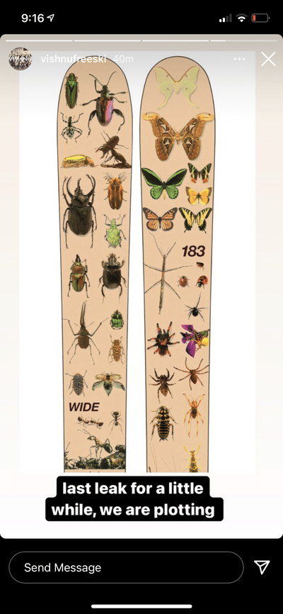
I’ve always wanted to design a topsheet without visible logos that is still instantly recognizable as a vishnu ski since it fits with the themes and motifs I have developed (water, vibrant and saturated colors, photo realism) so that’s what I did on the rivers.
it’s ok to try new things, if I just did the text logo on everything that would get boring.
Skiblade420Man I’m not too hyped on the graphics this year. I feel like the vinnys are too bright, that that the river doesn’t seem like a pronounced graphic really, more just a color, and that the glass is graphic is gonna seem un recognizable once there’s a little snow on it.