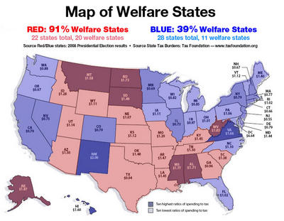
Id like to see this in more detail, as in county by county, city by city, to see if the welfare is coming out of liberal or conservative areas, and if the welfare is going to liberal or conservative people in those areas.
as the map is, it does not show that "conservatives rely more on welfare" there are too many other factors that could contribute to this.
if you go to many of those southern states, yes there are tons of areas full of very poor, uneducated people, probably relying on welfare, ive personally spent a lot of time in alabama, georgia, and north carolina, and there are tons of super poor areas, especially when you get into the bigger towns/cities, and i would be extremely surprised if those areas were mainly conservative, just judging by how pro obama the areas SEEM to be. but you get outside of those cities and into the rural areas and it seems like anything outside of a city is medium income families, and those are the areas that are very obviously conservative.
now you go to some of those NE states and most of their population comes from big cities, which are almost always liberal, the conservatives in the rural areas dont make up enough of the population, where in the south. they do.
anyway, not saying im completely right, but it just seems like if you went person by person you would get much different results. when you have extremely generic "data" like these maps, thats usually the case, and the reason for not going into more detail...