It looks like you are using an ad blocker. That's okay. Who doesn't? But without advertising revenue, we can't keep making this site awesome. Click the link below for instructions on disabling adblock.
Welcome to the Newschoolers forums! You may read the forums as a guest, however you must be a registered member to post.
Register to become a member today!
Line really lost a core piece of their brand identity with losing Pollard. Like a girl dying their hair kind of green after a break up. Give them some to find to find themselves.
I wish companies put out more plain black skis, I think they always look the best. Like the past few years of blends, jetskis, or the black on3p topsheet
Agreed I like darker colored top sheets ways easier to find in the snow, all white skis are so confusing to me. 4frnt skis always look great on snow the new Devs and Renegade look amazing
Skiblade420I wish companies put out more plain black skis, I think they always look the best. Like the past few years of blends, jetskis, or the black on3p topsheet
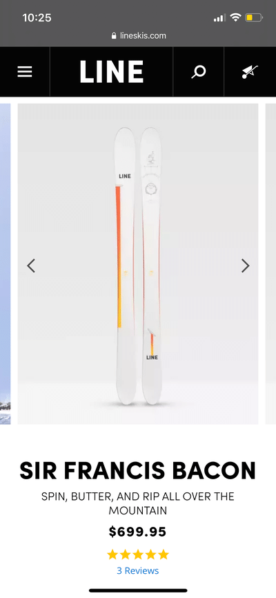
I like the Bacons graphic. Big fan of simple graphics. But I don’t like it on the bacon just because of the history of the ski. And the Sakana and pescado are terrible. Glad I got Sakanas when I did.
All topsheets should be of artwork. Digital / Painted / drawings IDK, but bland "designs" are boring. Should be at home on my feet or on my wall. More Moment, Pollard, Benchetler, Vishnu, 4frnt, Revolts, and bring back Madsteez. Less Rossignol, Blackcrows, and Faction.
**This post was edited on Aug 19th 2021 at 5:41:49pm
EightsailsAll topsheets should be of artwork. Digital / Painted / drawings IDK, but bland "designs" are boring. Should be at home on my feet or on my wall. More Moment, Pollard, Benchetler, Vishnu, 4frnt, Revolts, and bring back Madsteez. Less Rossignol, Blackcrows, and Faction.
**This post was edited on Aug 19th 2021 at 5:41:49pm
I can appreciate they want to be gender inclusive, be outside trends, and have a timeless product etc. But dayum what waste of talent and blank canvases IMO. Pollards earlier works on line are some of the most genderless / timeless / solid stuff we've had on skis.
EightsailsI can appreciate they want to be gender inclusive, be outside trends, and have a timeless product etc. But dayum what waste of talent and blank canvases IMO. Pollards earlier works on line are some of the most genderless / timeless / solid stuff we've had on skis.
Yeah exactly. The skis are probably amazing but you have one of the best ski designers/artists in the industry just do a 5 year graphic or something.
Woflowz are you gonna join the reckoner hype train now? You would look spiffy in those neon ones since you love fat skis
WoFlowzTalk to brad about that k2 graphic, but personally I like that K2 is going back to their bright detailed graphics and especially their reckoner series
I actually think I like every single one of those graphics u posted lol. They don’t blow me away but I would never see those ina lift line and be like oh those are ugly
DesertStixWoflowz are you gonna join the reckoner hype train now? You would look spiffy in those neon ones since you love fat skis
Rly rly tempted to pick up a pair but I’ve got a pair of unmounted brand new marksman also. :/ guess I’ll just have 2 pairs of marksman and one pair of reckoners and a pair of MSP99s 😉
WoFlowzRly rly tempted to pick up a pair but I’ve got a pair of unmounted brand new marksman also. :/ guess I’ll just have 2 pairs of marksman and one pair of reckoners and a pair of MSP99s 😉
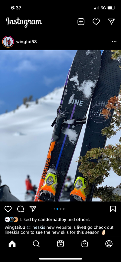
Putting white top-sheets/bases on wide skis that are catered to skiing pow will never make any sense to me. I'm not sure if these ski designers have ever lost a ski in pow but having white skis makes it a nightmare to find your ski(s) after a crash in pow.
I swear this line was just like not released or something cause of covid. Maybe it was just a regional thing but I still to this day have never seen a pair in real life. People already riding the 2021-2022, just never saw these at all…
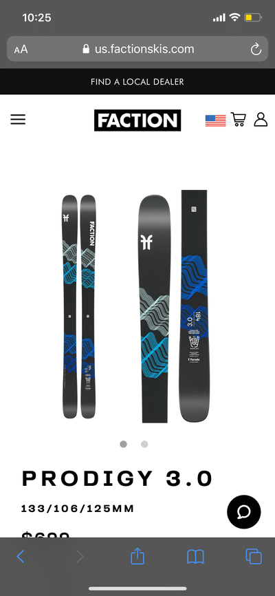
BradFiAusNzCoCaI agree. Really did not like the black prodigy’s. I like the prodigy’s for their eye catching designs.
As in I didn’t like these:
**This post was edited on Aug 20th 2021 at 12:14:41am
I’ve seen them and I can put them in 2 distinct groups:
1) people in australia buying them because “they’re not available in northern hemisphere yet” in 2020
2) finnish kids because all the 19/20 prodigy’s were sold out
DesertStixI swear this line was just like not released or something cause of covid. Maybe it was just a regional thing but I still to this day have never seen a pair in real life. People already riding the 2021-2022, just never saw these at all…
idk if I am missing the thread, but couldn't find a more proper one than this. So apologies before hand.
Thinking of treating myself this season and would appreciate your suggestion for an All Mountain fun ski pair (advanced skier) from 2021-22 the products (open to all brands)? Thanks a bunch!
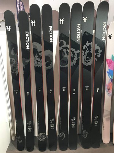
Those are fucking dope dude, I love the black matt and the animal thing (especially the bear of the 3s). I have a pair of 3.0 and raw pivots waiting to be paired in the garage it's gonna be 🔥
BradFiAusNzCoCaI agree. Really did not like the black prodigy’s. I like the prodigy’s for their eye catching designs.
As in I didn’t like these:
**This post was edited on Aug 20th 2021 at 12:14:41am
WoFlowzTalk to brad about that k2 graphic, but personally I like that K2 is going back to their bright detailed graphics and especially their reckoner series
Thanks my dude!
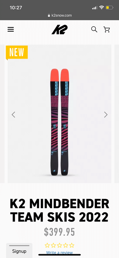
No but in all seriousness and without answering to any other brand, the aim at K2 is to make our products look interesting in our own way AND to be as far away from any other brand in the industry as possible. The bright colors and patterns of this years Mindbenders are abstract forms that represent the feelings that the ski has. Case in point - the more flowy pattern with the almost "weird" mashup of colors on the 116 is meant to represent the unique approach that this particular ski has to the mountain. That ski is literally made to make you think differently to your approach. The 108ti is a mashup of colors and conflicting patterns in an abrupt way to show that this ski is built for mashing through the variable snow and crud. The 99ti is sharp and angular and a more serious color pallet for hard charging and laying trenches. This idea goes through the model line.
I'm a big fan of modern, more expressionist style art that portrays an emotion rather than slapping a tree or a mountain on a ski. No shade to anyone or any other brand but to me that is the same thing as planting a fake tree in a garden.
Not super relevant but I personally hate topsheets that make a picture between the two skis. Wearing skis on the "wrong" feet looks weird, but if you always wear them on the "right" feet it seriously shortens the life of your sticks. I very much enjoy graphics where you can wear the skis either way and it still makes sense
r00kieLine really lost a core piece of their brand identity with losing Pollard. Like a girl dying their hair kind of green after a break up. Give them some to find to find themselves.
I think they did a great job with the blend and chronic this year, yeah there still more on the graphic design side but they look sick, the actually has colors now! But the honeybadgers look like shit
No but in all seriousness and without answering to any other brand, the aim at K2 is to make our products look interesting in our own way AND to be as far away from any other brand in the industry as possible. The bright colors and patterns of this years Mindbenders are abstract forms that represent the feelings that the ski has. Case in point - the more flowy pattern with the almost "weird" mashup of colors on the 116 is meant to represent the unique approach that this particular ski has to the mountain. That ski is literally made to make you think differently to your approach. The 108ti is a mashup of colors and conflicting patterns in an abrupt way to show that this ski is built for mashing through the variable snow and crud. The 99ti is sharp and angular and a more serious color pallet for hard charging and laying trenches. This idea goes through the model line.
I'm a big fan of modern, more expressionist style art that portrays an emotion rather than slapping a tree or a mountain on a ski. No shade to anyone or any other brand but to me that is the same thing as planting a fake tree in a garden.
Not trying to throw any shade as aggressive as my post may have been. Glad your sticking to your guns and I’m sure if I saw them in person I’d think they look sick
FlackerNot trying to throw any shade as aggressive as my post may have been. Glad your sticking to your guns and I’m sure if I saw them in person I’d think they look sick
It's all good! Just wanted to shed some light as to where our heads were at during the design process. At the end of the day we're stoked that people have something to say about K2 again!
Yeah I really don't dance with all these minimalist, meaningless, 'safe' designs. Reminds me of cookie cutter housing developments all over the Mountain West and the grey/black/white color palatte that every 30 something tech couple wants to have in their modern condo. There's no culture, individuality, or daring to any of these designs. But skis aren't all about what's on top, necessarily.
mattytruYeah I really don't dance with all these minimalist, meaningless, 'safe' designs. Reminds me of cookie cutter housing developments all over the Mountain West and the grey/black/white color palatte that every 30 something tech couple wants to have in their modern condo. There's no culture, individuality, or daring to any of these designs. But skis aren't all about what's on top, necessarily.
Incidentally, those boring uninspired late-20-30’s people are the target demographic for most ski companies. Core doesn’t sell.
So like, stripes was two years ago now? Now it's color small color-blocked sections? Whatever, it is pretty funny to see some brands follow trends so hard that they're all interchangeable, while others keep doing what they've been doing forever.
Every year I marvel at how both Moment and ON3P can somehow get even more on-brand with their graphics. While the current K2's may not be everyone's cup of tea, it really feels like they're coming into their own this year, cohesive, yet unique. I dig.
And finally, since I may have ruffled some feathers with my comments about last year's 4frnt graphics, I think this season's are absolutely stellar. Impressive roster of artists, who all seemed to nail the assignment.
cydwhitSo like, stripes was two years ago now? Now it's color small color-blocked sections? Whatever, it is pretty funny to see some brands follow trends so hard that they're all interchangeable, while others keep doing what they've been doing forever.
Every year I marvel at how both Moment and ON3P can somehow get even more on-brand with their graphics. While the current K2's may not be everyone's cup of tea, it really feels like they're coming into their own this year, cohesive, yet unique. I dig.
And finally, since I may have ruffled some feathers with my comments about last year's 4frnt graphics, I think this season's are absolutely stellar. Impressive roster of artists, who all seemed to nail the assignment.
I am a huge fan of the Reckoner 102 graphics this year. Brad and his team are killing it!
It’s very rare that a new ski I own is released and I don’t instantly think “damn my pair suck now and I want those” but I like the OG colorway much more. This is not Brad or K2 critique lol more a comment on how much I love the first graphics with the Orange bases that pop on the snow…
BigPurpleSkiSuitI am a huge fan of the Reckoner 102 graphics this year. Brad and his team are killing it!
WoFlowzRly rly tempted to pick up a pair but I’ve got a pair of unmounted brand new marksman also. :/ guess I’ll just have 2 pairs of marksman and one pair of reckoners and a pair of MSP99s 😉
DesertStixIt’s very rare that a new ski I own is released and I don’t instantly think “damn my pair suck now and I want those” but I like the OG colorway much more. This is not Brad or K2 critique lol more a comment on how much I love the first graphics with the Orange bases that pop on the snow…
Haha no worries dude! I really do love the first year Reckoner 102 as well. Don't get me wrong, I love the new ones with the mushrooms but the first year Reckoner 102, or whole Reckoner collection from that year, will always be something I hold close. The 2020 collection was the first year that I worked on with K2 and out of the whole collection those are the ones that I register with the most and ski the most.
Also, those orange bases may make a return someday... :)
There is something extremely satisfying about neon bases glowing on white snow. The purple top sheets with neon bases would have been TOUGH! You’ve got NS positively talking about K2, I’d say you’re doing a great job
bradwaltersHaha no worries dude! I really do love the first year Reckoner 102 as well. Don't get me wrong, I love the new ones with the mushrooms but the first year Reckoner 102, or whole Reckoner collection from that year, will always be something I hold close. The 2020 collection was the first year that I worked on with K2 and out of the whole collection those are the ones that I register with the most and ski the most.
Also, those orange bases may make a return someday... :)
DesertStixThere is something extremely satisfying about neon bases glowing on white snow. The purple top sheets with neon bases would have been TOUGH! You’ve got NS positively talking about K2, I’d say you’re doing a great job
I agree completely! Nothing like making the snow glow under the ski ESPECIALLY on powder skis.
...and thank you. I am proud of the work the whole team is doing at K2 and just happy to be a part of it.