It looks like you are using an ad blocker. That's okay. Who doesn't? But without advertising revenue, we can't keep making this site awesome. Click the link below for instructions on disabling adblock.
Welcome to the Newschoolers forums! You may read the forums as a guest, however you must be a registered member to post.
Register to become a member today!
Mr.BishopWell, there's multiple posts from me asking for details as to what people do and don't like, so we can make changes based off of those opinions.
Just fuckin' with ya.
my two biggest problems with it are how the thumbs up thumbs down looks now, i liked it more when you had the red/green bar. i also don't like how the reply button is, i liked the old one more
JAHpowHere it is with "Editor off". Same issue. I'm on the app and I had the same problem on mobile. I'm on the current version of the app. Android, Galaxy S8+
And "Editor on"
AH -
Ok, so we looked into this and basically it isn't a bad design decision, its simply the fact that the space there is left for the Keyboard.
You happen to be rocking the longest phone on the market right now, so it is especially pronounced for you.
The blank space isn't the problem here once you're actually in that top space, because as soon as you click there boom the keyboard comes up.
What specifically about the space is it that you don't like - is it just that it visually feels like a waste or is it that you're actually having trouble navigating once the keyboard comes up?
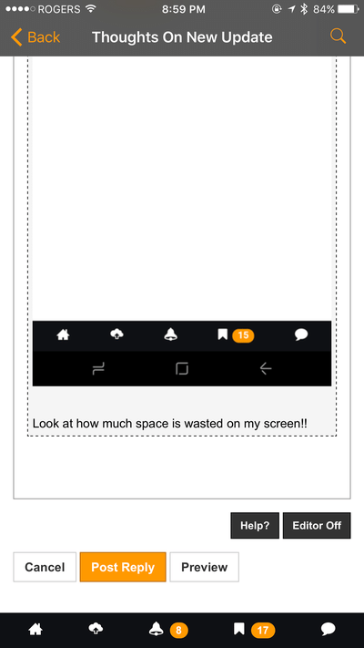
I also get the tiny text box in my app that was discussed earlier
Can we just redesign the mobile site so it looks and functions like the last iteration?
No we can't, we used a framework for this one which allowed us to make an app. Things will change a bit because of this, and you will have to get used to some of the changes. There was no other way to do it properly, that old layout may have been popular but it was an unmaintainable mess of front end code. It simply had to go.
stinky_petemy two biggest problems with it are how the thumbs up thumbs down looks now, i liked it more when you had the red/green bar. i also don't like how the reply button is, i liked the old one more
The look of thumbs up / thumbs down will be something you need to get used to. As I mentioned above, we had to make some hard decisions in order to move to a modern front end framework which allowed us to build the app.
Same with the reply button - using those icons are one part of a ton of tiny little changes to improve page speed. Give it some time, in a few months you will not even notice anymore.
Mr.BishopWhoa - you have something seriously wrong going on there. Is that the app or the mobile site?
This is the bottom of the screen as I see it:
And I figured it out. Click "editor on". It works as intended like that. We should fix the view if the editor is off.
That still doesn't make sense. Your message box is still way bigger than mine is even if I have a larger screen.
Here's the same layout that I have compared to yours above -
It doesn't go all the way down to the bottom of the screen like yours.
I sorta understand where you're coming from for the keyboard. Here's what I have -
But I feel like the box should be resetting to a larger size given the example from your phone.
Ok, so we looked into this and basically it isn't a bad design decision, its simply the fact that the space there is left for the Keyboard.
You happen to be rocking the longest phone on the market right now, so it is especially pronounced for you.
The blank space isn't the problem here once you're actually in that top space, because as soon as you click there boom the keyboard comes up.
What specifically about the space is it that you don't like - is it just that it visually feels like a waste or is it that you're actually having trouble navigating once the keyboard comes up?
I don't like that I can only see like two sentences typed out at a time. It's not convenient to use for long posts/posts with images. I'm trying to remember what the old box looked like, I never had complaints about that one on this phone.
JAHpowI don't like that I can only see like two sentences typed out at a time. It's not convenient to use for long posts/posts with images. I'm trying to remember what the old box looked like, I never had complaints about that one on this phone.
I mean I think the core issue here is having a better ability to edit long posts, right? I don't think it can be simply solved with a bigger box, we need to tweak the interface overall. We'll definitely work on that.
Fred_BearI dislike not having the top bar pinned anymire
i think that's my main gripe with the update. it seems like there would be room for shortcut buttons on the top part that is pinned or maybe put it at the bottom like the app
cornholioi think that's my main gripe with the update. it seems like there would be room for shortcut buttons on the top part that is pinned or maybe put it at the bottom like the app
Both things are doable. I would ask, why not just use the app instead of mobile?
I listed a couple reasons i dont like unnecessary apps earlier.
1. Apps generally take up too much space on my phone. (You guys seem to have done a good job keeping this at a minimum.)
2. Apps tend to generate unwanted push notifications (which this did). Tbh I didn't check if this could be turned off until just now when I was thinking about it. these usually come in the middle of the work day and I never had time to search the settings for this when one popped up.
Most likely reason I will always prefer Web is that when I get on ns it's usually when I quickly go between whatever time wasting sites I frequent. IMO it's easier to just type the first couple letters in the address bar to bounce from site to site in a browser window rather than back out of one app and go to another app just to check a web page real quick.
Mr.BishopBoth things are doable. I would ask, why not just use the app instead of mobile?
cornholioI listed a couple reasons i dont like unnecessary apps earlier.
1. Apps generally take up too much space on my phone. (You guys seem to have done a good job keeping this at a minimum.)
2. Apps tend to generate unwanted push notifications (which this did). Tbh I didn't check if this could be turned off until just now when I was thinking about it. these usually come in the middle of the work day and I never had time to search the settings for this when one popped up.
Most likely reason I will always prefer Web is that when I get on ns it's usually when I quickly go between whatever time wasting sites I frequent. IMO it's easier to just type the first couple letters in the address bar to bounce from site to site in a browser window rather than back out of one app and go to another app just to check a web page real quick.
I mean fair enough, you do you. Whatever works is whatever works. :)
But yes, you can turn off push notifications quite easily.
You can also multi task between apps and browsers on most mobile phones... but whatever I get it we need to make sure the mobile web experience is sweet too. 100% fair to ask.
Mr.BishopI mean I think the core issue here is having a better ability to edit long posts, right? I don't think it can be simply solved with a bigger box, we need to tweak the interface overall. We'll definitely work on that.
Too bad it's not that simple, cuz that's all it would take (for me)
There's something new, a grey bar at the top of the screen that I didn't notice before. Is that the "ticker" for announcing new edits and stuff, but there's just nothing on it yet?
You can turn them off easy, but apparently the app will still send them. I turned them off for media and news shit the other day and just now got a notification about some jossi wells thing. I'll stand by my statement that I dislike apps that send unnecessary push notifications
Mr.BishopBut yes, you can turn off push notifications quite easily.
cornholioI listed a couple reasons i dont like unnecessary apps earlier.
1. Apps generally take up too much space on my phone. (You guys seem to have done a good job keeping this at a minimum.)
2. Apps tend to generate unwanted push notifications (which this did). Tbh I didn't check if this could be turned off until just now when I was thinking about it. these usually come in the middle of the work day and I never had time to search the settings for this when one popped up.
Most likely reason I will always prefer Web is that when I get on ns it's usually when I quickly go between whatever time wasting sites I frequent. IMO it's easier to just type the first couple letters in the address bar to bounce from site to site in a browser window rather than back out of one app and go to another app just to check a web page real quick.
Ahh I see you have an iPhone.... haha, jk man. When you say unwanted push notifications do you mean the promo notifications or the notifications when people quote your posts and stuff?
milk_manAhh I see you have an iPhone.... haha, jk man. When you say unwanted push notifications do you mean the promo notifications or the notifications when people quote your posts and stuff?
Lol no iphone. I figured iPhone users would be the ones who can't live without the app.
Yes, those notifications. I left the quote ones turned on for now but I will probably shut them off.
cornholioPlease show me how to turn off the media and news story notifications. This is what I have in my settings and it doesn't work
I think doug was referring to turning off notifications through your phone, not the app. If you don't want any notifications just turn them off on your phone OS.
It shouldt have to be all or nothing though, why would there be options in the app to be selective about it you can't actually change it? Maybe I want to keep notifications for quotes or pms but dont want all the other stuff...
eheathI think doug was referring to turning off notifications through your phone, not the app. If you don't want any notifications just turn them off on your phone OS.
cornholioIt shouldt have to be all or nothing though, why would there be options in the app to be selective about it you can't actually change it? Maybe I want to keep notifications for quotes or pms but dont want all the other stuff...
Ohhh i see. We are working on developing a ton of options for alerts, but it requires us to basically rebuild the entire alert system, so the plan is to have those options we just cant do everything at once.
Ok so it shouldn't be working correctly yet. Got it
eheathOhhh i see. We are working on developing a ton of options for alerts, but it requires us to basically rebuild the entire alert system, so the plan is to have those options we just cant do everything at once.
i totally feel people how don't like (opt out) push notifications but the other day it notified me that the jossi wells tourney was live streaming and i tuned in and enjoyed the hell out of it. I thought it was a great thing all around, i learned about and watched a free high quality live stream and without the notification i wouldnt have known about it at all
cornholioPlease show me how to turn off the media and news story notifications. This is what I have in my settings and it doesn't work
cornholioOk so it shouldn't be working correctly yet. Got it
Yes sorry - we actually need to re-do the notification system to make it more configurable. Right now it is really all-or-nothing. The behaviour you want should be coming soon.
SofaKingSicki totally feel people how don't like (opt out) push notifications but the other day it notified me that the jossi wells tourney was live streaming and i tuned in and enjoyed the hell out of it. I thought it was a great thing all around, i learned about and watched a free high quality live stream and without the notification i wouldnt have known about it at all
We've been trying very hard to use "trust" as our main ethics when sending the overall notifications. Since we can't yet customize it per user... we have really been trying to only send stuff which is really breaking and would be of interest to the audience.
Any others have feedback on the few other notifications we've been sending?
Yo Bishop, any updates or thoughts on bigger text box and refreshing forum, threads, etc by scrolling? Eheath said he can scroll refresh but that doesn't work for me.
(drunken rant*) . came here to say how deeply i miss the old newschoolers. I fully understand why changing the page format was necessary as a means to improve traffic flow/media output. However, it just doesn't feel the same anymore. Maybe life is changing and I am bad at embracing it. But i feel like the old page design made me feel like part of a community. Now it just looks like media is exploding in my face. Maybe the community has changed and that's why it's harder to relate, but that doesnt seem like it should be the case. We are all here for the same reason: because we love skiing. I guess im just not feelin the love :(
J_MAC(drunken rant*) . came here to say how deeply i miss the old newschoolers. I fully understand why changing the page format was necessary as a means to improve traffic flow/media output. However, it just doesn't feel the same anymore. Maybe life is changing and I am bad at embracing it. But i feel like the old page design made me feel like part of a community. Now it just looks like media is exploding in my face. Maybe the community has changed and that's why it's harder to relate, but that doesnt seem like it should be the case. We are all here for the same reason: because we love skiing. I guess im just not feelin the love :(
What part of the old home page do you miss? More or less its all the same content, just the layout is different
i miss the video of the day, it still kind of exists, but not in the same way. it's not so much of a "big thing" anymore, which i also understand why it was beneficial in many ways to change , but at the same time the vod was THE reason why i would religiously visit the site, it just doesnt have the same appeal anymore. the new page just looks like the pictures are jumping out at you too much, the advertisements are more obvious. it lacks the subtlety and zen of the oldschool.