Title says it all. Post pics of your least favorite topsheet.
Sep 10 2014 11:27PM
saskskierDynastar Trouble Makers (these are the worst, but really any generation)
dont hate on the OG trouble maker
Sep 10 2014 11:35PM
2014 masterminds look like weird zebra things
Sep 10 2014 11:40PM
elm.these suck, but also rock
I don't like the topsheets but the bases are pretty sick IMO
Sep 10 2014 11:47PM
Thomas should post a photo of his Billy Goats.
Sep 10 2014 11:56PM
Sep 10 2014 11:58PM
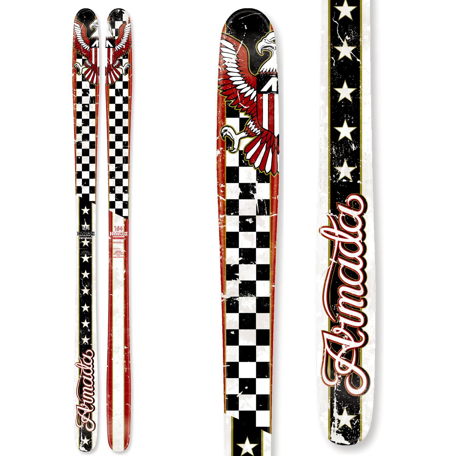
http://images.evo.com/imgp/1500/68962/326283/armada-halo-2-skis-2014-164-front.jpg
Don't know how these haven't made it on this thread yet
Sep 11 2014 12:00AM
SteezyJapaneezyFatypus makes some ugly skis.
Ugly topsheets, bad ass skis. I kind of like some of there top sheets though. Keeping it simple and letting the ski do the talking. Not of a fan of the MJ top sheet.
Fan of the D'root top sheet this year
Also kind of like the play on bases/topsheet combination for this years g-butters.
Sep 11 2014 12:13AM
I can't stand seeing these puppies. Don't know how they'd ski, but I think they look wretched.
Sep 11 2014 12:15AM
I have never liked any of Dynastar, but these are god awful
Sep 11 2014 12:24AM
CraigskisI can't stand seeing these puppies. Don't know how they'd ski, but I think they look wretched.
Don't worry they do in fact ski like your reaction to blue waffles.
Sep 11 2014 12:25AM
BrennenMi really liked the moment vice graphics from two years ago and i ski last years, but I'm really not a fan of the graphics on this years. . . .it just looks too cluttered
It looks like Downtown Reno.
Sep 11 2014 12:38AM
i just want to put it out there for ALL ski companies, that not every ski for women needs to be pink and purple. i don't need another pair of pink and purple fucking skis.
Sep 11 2014 12:51AM
CraigskisI can't stand seeing these puppies. Don't know how they'd ski, but I think they look wretched.
They made a wider version called the Mr. Hankey pro model...
This one is named the "Joy". The design department nailed it.
Sep 11 2014 1:00AM
N.A.RI have never liked any of Dynastar, but these are god awful
Let's be honest here. With the exception of the Candide's, Dynastar has never a graphically appealing ski.
Sep 11 2014 1:47AM
neutralzombiei just want to put it out there for ALL ski companies, that not every ski for women needs to be pink and purple. i don't need another pair of pink and purple fucking skis.
As a guy I really like what armada did for the 2014 arw.
Sep 11 2014 5:27AM
Artacunothe armada triumphs just have to much going on
I wish these came in a park ski.
Sep 11 2014 5:45AM
A lot of the early Line designs were eye burning ugly. Like '09 afterbangs and chronics
Sep 11 2014 6:05AM
rudager
Your signature makes that photo so much more funnier.
Sep 11 2014 6:54AM
I guess you could say the whole icelantic line of skis
Sep 11 2014 7:18AM
joesdapoesA lot of the early Line designs were eye burning ugly. Like '09 afterbangs and chronics
Are you nuts?
Sep 11 2014 7:29AM
todays subject in class today will be...
how all art is subjective and all you crap nuggets suck
Sep 11 2014 9:34AM
Common Rossignol, these are awful.
Nordica is great at making yearly ugly topsheets.
No idea why they went with that graphic, especially when they probably had one of the nicest topsheets of all time the year before.
Sep 11 2014 9:54AM
BumblesteezeNo idea why they went with that graphic, especially when they probably had one of the nicest topsheets of all time the year before.
Hahaha "woof" hahaha great effort.
Sep 11 2014 10:16AM
really anything nordica i think. the OMW are pretty solid and this years soul rider are sick but thats it
Sep 11 2014 11:05AM
.LincolnHahaha "woof" hahaha great effort.
They had these the year before:
One of my favourite topsheet. The entire lineup looked nice and simple.
Sep 11 2014 11:32AM
BumblesteezeNo idea why they went with that graphic, especially when they probably had one of the nicest topsheets of all time the year before.
.LincolnHahaha "woof" hahaha great effort.
I had those when I was younger. I picked them specifically because I thought the top sheet was so badass.
Memories.
Sep 11 2014 11:38AM
frankcoldertodays subject in class today will be...how all art is subjective and all you crap nuggets suck
yeah it's subjective, so why are you crying that people have opinions on them?
plus, art is a strong word for a lot of these. a lot of ski graphics are just terrible
Sep 11 2014 12:36PM
rossignol makes some pretty ugly skis all around
Sep 11 2014 1:13PM
joesdapoesA lot of the early Line designs were eye burning ugly. Like '09 afterbangs and chronics
haha 09 is not what i consider "early line designs" , early line designs in my opinion would be the original orange 1260s ( fully symmetrical twin, way ahead of its time ), the og dark-side skis that pollard rode back in the day, the og motherships with orange base, the skogan sprang pros with ship on the tail, and the line ostness dragon . those are some of what i would consider early line designs , and each one of them had a way badass graphics all around. its just plain wrong calling 09 graphics as early designs. do a lil research. line been around for ever, not like they started making skis in 08 or 09 , and imo , the real early line designs and graphics were the best out in their day, and honestly some of there older graphics are still way better than most skis out these days any way.
Sep 11 2014 1:44PM
montananhaha 09 is not what i consider "early line designs" , early line designs in my opinion would be the original orange 1260s ( fully symmetrical twin, way ahead of its time ), the og dark-side skis that pollard rode back in the day, the og motherships with orange base, the skogan sprang pros with ship on the tail, and the line ostness dragon . those are some of what i would consider early line designs , and each one of them had a way badass graphics all around. its just plain wrong calling 09 graphics as early designs. do a lil research. line been around for ever, not like they started making skis in 08 or 09 , and imo , the real early line designs and graphics were the best out in their day, and honestly some of there older graphics are still way better than most skis out these days any way.
yeah those era line graphics were awesome. their shit nowadays is always busy bright shit. they used to be some of the only good looking skis, now theyre just another group of busy design/collage skis like salomon etc except with more irony and tongue in cheek-ness
Sep 11 2014 2:56PM
how has no one brought these up? by far the ugliest pair of skies i've ever owned.
Sep 11 2014 3:17PM
Mr_Geezlehow has no one brought these up? by far the ugliest pair of skies i've ever owned.
You shut your face. Those have a dragon skeleton with detachable eyeballs looking up a slutty red riding hoods dressy thing. I'd classify that a solid 7 of a topsheet.
Sep 11 2014 4:01PM
Nordica is great at making yearly ugly topsheets.
All of this years and last year's were great... Honestly though the quality of all nordicas are mind blowingly good....... Don't judge skis by graphics lol
Sep 11 2014 4:19PM
ShredsterrYou shut your face. Those have a dragon skeleton with detachable eyeballs looking up a slutty red riding hoods dressy thing. I'd classify that a solid 7 of a topsheet.
Color scheme blows tho. Red would be cooler
Sep 11 2014 4:25PM
PatrickNealAs much as I love tanner....
Hey those are my skis!
this is a ugly top sheet
Sep 11 2014 4:28PM
WVskiingFucking hate cats
dude thats a sick top sheet and cats are amazing