
Before I get into the numbers, I want to make it very clear that this was NOT a scientific study. I’ll provide the statistics and some colorful commentary, but it’s up to you to make your own conclusions. With that being said, I do believe that this sampling of nearly 500 “absolute unique visitors” does a good job of representing college students at Penn State (and probably around the country). I’ve been involved in the snowboard club for 4 years and I can tell you that we get a wide range of students. From engineers to teachers to liberal arts majors, the nature of snowboarding tends to bring in a fairly diverse crowd. Our students range from freshman to super seniors, although we do tend to have a surprisingly large (40%?) number of freshman in the club. Now that I got the disclaimer out of the way, let’s dive into the numbers after the jump!
The main statistic that I was interested in was Operating System usage. It always felt like everyone was using a Mac on campus. The stats revealed that 58% of the visits to our site are from Mac users! This seems like a pretty accurate statistic and is well above the “accepted” market share of Apple computer, which is around 10%. It’s also interesting that Snow Leopard adoption among visitors seems to be a little lower than I expected with only 25% of  users running the new operating system. Lastly, I noticed that hardly anyone was running Linux. (In fact, most of those visits might actually be me…)
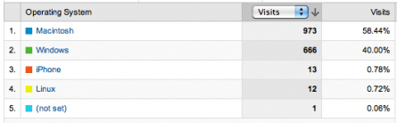
Operating System breakdown shows Macs are the clear winner
The next statistic, which will be of particular interest to web developers, is the Browser Usage statistics for the Snowboard Club website. I expected that the number of Internet Explorer (IE) users would be a bit lower than normal due to the fact that most of the visitors are savvy college students. IE came in at only 20% which was evenly distributed between IE7 and IE8. I was surprised at the quick adoption of IE8 and pleased that less than 1% of users are on IE6. Surprisingly, or maybe not given the above stats, the Safari browser is used by over half of the visitors at 51%. This tells me that most Mac users are content with using the default browser. Firefox continues to be very popular with 26% of the browser share, of which 8% is Mac users.
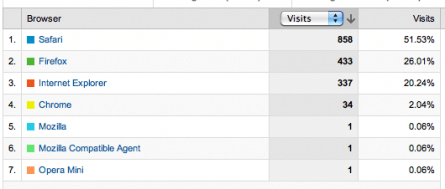
Browser Usage table showing some surprising stats
Next up we have the information about Screen Resolutions. This is another interesting stat for developers since we are always trying to squeeze in a few extra pixels of width to our sites without forcing some users to scroll horizontally. These stats confirm that my new 1000px wide layout is A-Okay. Another thing I noticed (and this could be a bit of a stretch), is that these stats seem to show that netbook usage among visitors is extremely limited. Most 11″ and smaller netbooks have no greater than 1024×768 resolution. As you can tell, this is a very small percentage of our visitors, and these might not even be netbooks!
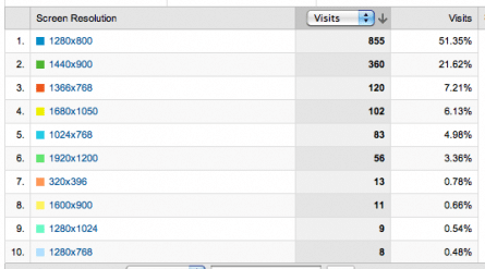
Most users are running a reasonable resolution. No more 800 x 600!
Another statistic that everyone loves to analysis is the Search Engine usage. A whopping 96% of our users are using Google as their preferred search engine to access our site. Bing and Yahoo are tied with a pathetic 2% share. To give you some perspective, in August 2009 Google had 64% of the US search market, Yahoo followed with 19%, and Bing with 9%. (source) This tells me that college students are just as in love with Google as us techies.
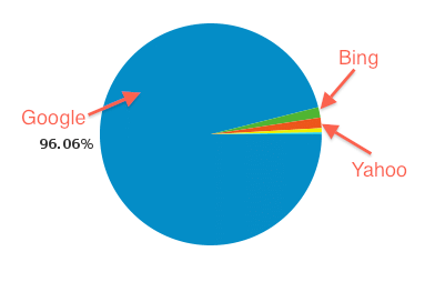
Google takes the cake when it comes to search.
Finally, I noticed that mobile use of the club website is very limited. Only a few users have accessed the site on low-resolution devices and mobile browsers. In regards to the content that users are viewing at our site, the forum is the clear winner. It does the best job of keeping users on the site as well as increasing the pages that visitors are viewing. As with any website, a community aspect has a big impact on getting those returning visitors.
In conclusion, I’m pretty excited about these statistics. As a web developer, it’s great to see that the bulk of your users are adopting the new technologies and staying up-to-date with the latest and greatest in technology. It confirms that my decision to drop IE6 support over a year ago was the right thing to do. I’m working on a new design for the site in my free time and I play to take some of these stats to heart and really provide the better user experience possible for my visitors. I hope that this information was useful to you and hopefully it can help you understand this critical segment of the market.
Comments